Superkicks
A sneaker culture storefront where the drop is the interface.
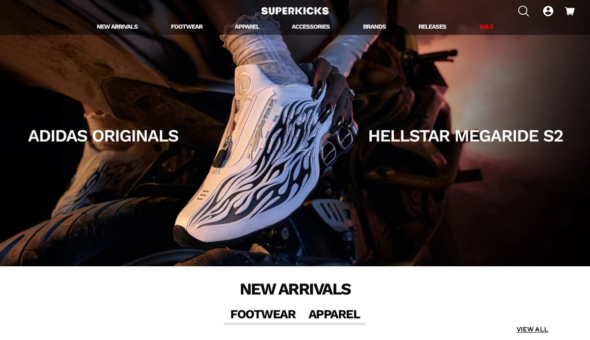
Superkicks is one of India's best known sneaker retailers, selling limited drops from Nike, adidas Originals, New Balance and Asics alongside apparel and care products. The brief was to make an inventory heavy Shopify catalogue feel like a culture destination rather than a grid of SKUs without slowing down the one thing sneakerheads come for: finding the pair and checking out fast.
- Role
- Visual Design, Ecommerce UX, Art Direction
- Services
- Storefront design, Merchandising system, Campaign layouts
- Tools
- Figma, Shopify, Photoshop
Sector
Ecommerce Sneaker retail
Market
India, D2C + retail stores
Focus
Drops, product discovery, checkout
Year
2024
The problem
Sneaker retail lives on two conflicting rhythms. A drop needs heat: full bleed campaign imagery, countdowns, hype. The rest of the catalogue needs calm: filters, sizes, stock, price, done. Most storefronts pick one and lose the other either an editorial homepage that buries the catalogue, or a clinical grid with no brand voice at all.
The catalogue was also deep and uneven. Hundreds of styles across brands, several concurrent collections, and a stock picture that changes hourly during a release. Anything designed around fixed hero slots would break the moment merchandising changed.
Approach
I built the storefront as a set of merchandising modules rather than pages: a drop banner, a collection rail, an editorial split, a brand strip, a product grid. Each one holds any campaign asset the team uploads, so the homepage can be re sequenced weekly without touching layout.
Product photography does the talking. Type is condensed, uppercase and deliberately quiet so that colourways carry the page. Interface chrome filters, size pills, cart is neutral grey so it never competes with the shoe.
Discovery was rebuilt around how people actually shop sneakers: brand first, then silhouette, then size availability. Size and stock state are visible at the card level, so a sold out pair never wastes a click.
Design system
A tight palette off white ground, near black type, one signal colour for stock and sale states keeps hundreds of loud product images from fighting each other.
Cards, rails and grids share one spacing scale and one image ratio, so a new collection page can be assembled from existing pieces in minutes and still look art directed.
Selected screens
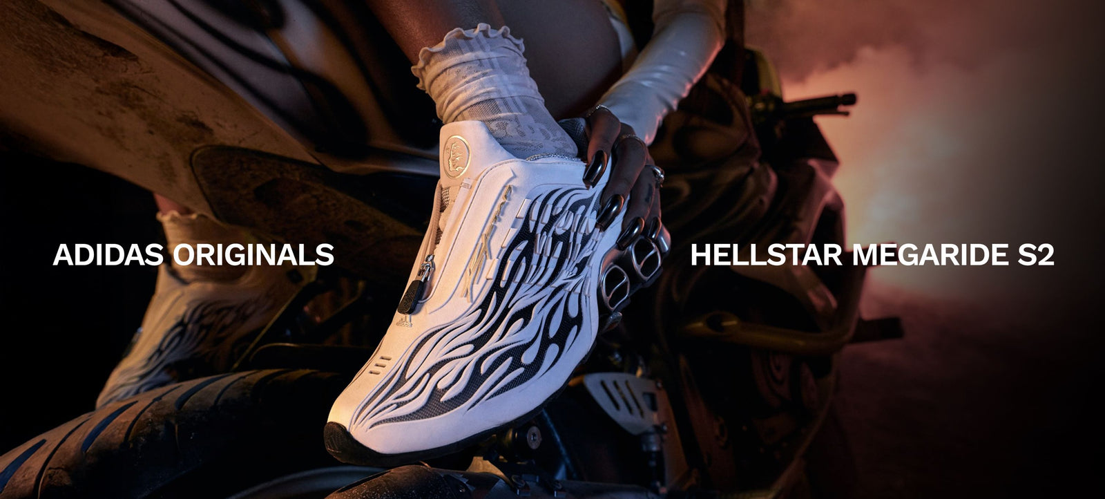
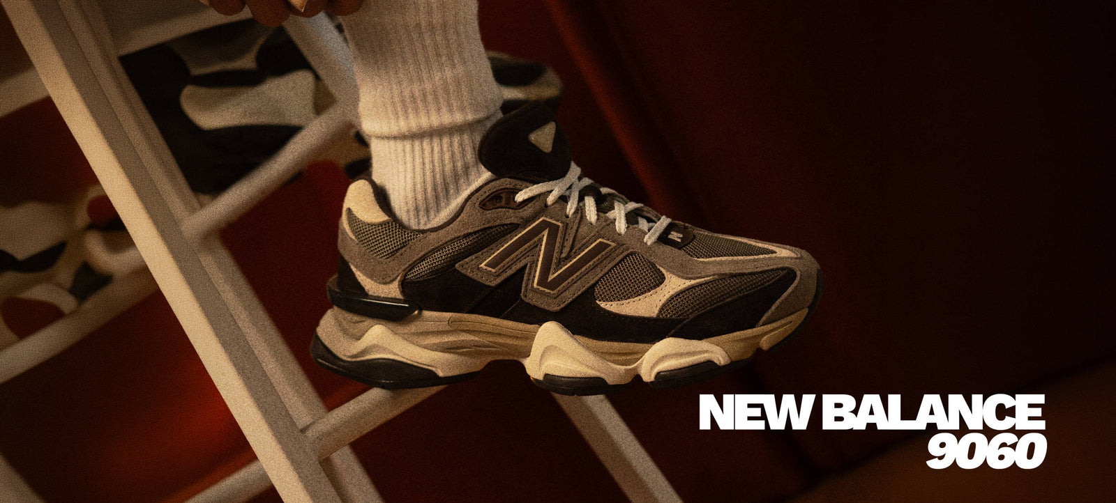
Drop first homepage
Campaign slots that swap weekly without a layout rebuild, so releases land the day they go live.
Stock aware browsing
Availability and size runs surfaced on the card, cutting dead clicks into sold out product pages.
Quiet chrome
Neutral interface, loud product. The photography carries the brand energy, not the buttons.
Outcome
A storefront that reads as a sneaker destination on the homepage and as a fast, filterable catalogue everywhere else.
Merchandising handed back to the team: campaigns are content, not engineering work.